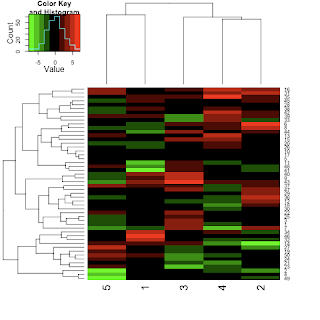
First lets make some example microarray data.
exampleData <- matrix(log2(rexp(1000)/rexp(1000)),nrow=200)This just makes two exponential distributions and takes the log2 ratio to make it look a bit like microarray fold changes, but this really could be able matrix of numbers.
Next I will just plot the most variable row/genes/whatever, this step is obviously optional but it reduces the size of the plot to make them easier to see, and normally I only care about the things that are different.
This just calculates the variance of each row in the matrix, then makes a new matrix of those rows that have a variance that is above the 75th percentile, so the top 25% most variable row.evar <- apply(exampleData,1,var)mostVariable <- exampleData[evar>quantile(evar,0.75),]
#install.packages("gplots")library(gplots)heatmap.2(mostVariable,trace="none",col=greenred(10))
Next we load the gplots package (install it first if you do not already have it). We then simple pass the mostVariable matrix to the heatmap.2 function. The trace="none" option removes a default, which is to add a line to each column, which I find distracting. The col=greenred(10) option uses another gplots function (greenred), which simply generates a color scheme from green to red via black. You could use any color scheme here such as col=rainbow(10) or a scheme from RColorBrewer.
That is about it really for basic heatmaps.
For more advanced heatmaps, you can do other things such as adding color strips to the rows or columns to show groupings, for example:
heatmap.2(mostVariable,trace="none",col=greenred(10),ColSideColors=bluered(5))
Another useful trick is not to use the default clustering methods of heatmap.2, but use your own. For example :
Here were are generating the ordering of the rows ourselves, in this case by the sum of the absolute values of each row. Then we turn off the clustering of the rows and the row dendrogram and get something like this:ord <- order(rowSums(abs(mostVariable)),decreasing=T)heatmap.2(mostVariable[ord,],Rowv=F,dendrogram="column",trace="none",col=greenred(10))
There are lots of other options too, but that is enough for today.


can u order columns instead of rows ? (like 1 2 3 4 5)
ReplyDeleteHi, Can you change how many rows get printed out.. like say I have 100 genes I want to see expression for different conditions, can I print 100 rows? So far it's defaulting to ~30 for me. Thanks!
ReplyDelete